The ITV television network began as a group of regional stations, each with their own identities. Each station used its own idents to create an individual identity until the late 1990s when ITV began to introduce a consolidated presentation package as part of a dedicated effort to unify its identity. This article looks at the history of presentation of ITV. Up until 1989, all of the ITV franchises had individual logos and idents. These individual logos and identities were created by the franchise for their own use and identification within the network. A generic, blocky-looking logo was used infrequently throughout the 1980s, often in a rainbow colouration for promos produced by the "Big 5" franchises (Thames, LWT, Granada, Yorkshire and Central), as well as holding slides used by some of the regions and Channel 4 (for cross-promotion purposes), but it was never used as the centrepiece of an identity, and was replaced by the next logo.
The history of BBC television idents begins in the early 1950s, when the BBC first displayed a logo between programmes to identify its service. As new technology has become available, these devices have evolved from simple still black and white images to the sophisticated full colour short films seen today. With the arrival of digital services in the United Kingdom, and with them many more new channels, branding is perceived by broadcasters to be much more important, meaning that idents need to stand out from the competition.
http://en.wikipedia.org/wiki/History_of_BBC_television_idents  8/10/14 TEACHER FEEDBACK
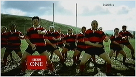
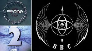
Be much more analytical in your work. Why is sky sports red white and blue? What do those colours represent? Give a lot more information. The history of BBC television idents begins in the early 1950s, when the BBC first displayed a logo between programmes to identify its service. As new technology has become available, these devices have evolved from simple still black and white images to the sophisticated full colour short films seen today. With the arrival of digital services in the United Kingdom, and with them many more new channels, branding is perceived by broadcasters to be much more important, meaning that idents need to stand out from the competition. This article describes the development of the BBC's main television channels' identities. http://en.wikipedia.org/wiki/History_of_BBC_television_idents Though the BBC was created in 1922, a formal BBC brand did not evolve until fairly late in the corporation's history. Initially, a mix of straight type or decorative design motifs were used – see for example the elaborate tracery of the initials found on the mosaic floor of the original reception of Broadcasting House (opened 1932). In 1936, the BBC became the world's first broadcaster of regular high-definition television, but there was still no specific or consistent use of BBC branding – on or off air. Instead, the gaps between the programmes were filled with early test cards or with on-screen announcers. The first attempt at a proper brand image came in 1953, when Abram Games was commissioned to design an on-air image, probably hastened by the imminent arrival of commercial competition. Games, who designed the logo for the Festival of Britain in 1951, created the logo nicknamed the 'Bat's wings' logo, an elegant and rather ethereal image which captured the spirit of the times. In reality, it was an elaborate mechanical brass contraption, with a tiny spinning globe in its centre – for BBC Scotland, the spot in the middle was replaced by a lion. This logo would appear before such programmes as Quartermass II. By the early 1960s, the 'Bat's Wings had been superseded by the BBC TV logo within a circle, behind which would appear a map of Britain split into broadcast regions. This set the style for a succession of circular images, which became the BBC's recognisable on screen identity. The channel's most famous emblem, the globe, appeared in its first guise on 30 September 1963. The first such ident featured the continuity announcer speaking the words 'This is BBC Television' over a spinning globe while a BBC TV caption would appear. BBC 2 beginsThe launch of a second channel in April 1964 saw the creation of BBC 1 and BBC 2 brands, with the distinctive horizontal stripes across the screen. A big publicity campaign was mounted to launch the new channel, using the rather playful symbol of a kangaroo with a baby in its pouch, with the even more unlikely names of Hullabaloo and Custard (visuals drawn by artist Desmond Marwood). The evening of the launch was famously marred by a power failure in West London, and at one point candles even appeared on the screen. First colour TVThe first colour pictures in the UK were broadcast by BBC2 in 1967 when it covered Wimbledon, to be followed by BBC1 in 1969. Then BBC 1 introduced the first version of the now famous 'mirror globe' – a rotating globe with a flat globe as visual behind it. The inclusion of the word 'colour' in the station ident could be viewed as a subtle reminder to the vast majority of the rest of the viewers still watching in black and white to buy a colour TV set. This BBC 1 colour globe was frequently seen in Monty Python's Flying Circus, which featured spoof continuity announcements. The 1970sThe mirror globe was revised in 1972 to use a more ornate font, and then from the mid 1970s to the mid 1980s the BBC 1 ident comprised various fonts, but always on the same deep blue background. Before the introduction of computer-generated graphics, the BBC idents were all mechanical models filmed by a black and white camera. The colour was added electronically, making it extremely easy to change the colour for each new look. The 1980sIn the 1980s, the futuristic stripy lettering was introduced for BBC 2 (designer, Oliver Elmes). In terms of its manufacture, this was a major departure – in that it did not use a model nor did it exist on film. Instead, the symbol was played out from a solid state device, which could produce both a static image and a moving sequence. The BBC 2 logo animation lasted four seconds, and showed both logo and stripes appearing and then magically disappearing. This logo was seen in spoof continuity announcements in series such as Not the 9 o'clock News and The Young Ones. After the successful transition of the BBC 2 logo, the BBC 1 globe and clock were also subtly refined. By 1985, computer graphics technnology had progressed sufficiently to retire the mechanical mirror globe in favour of a new computer-generated globe, which showed a semi-transparent blue globe with golden continents and gold BBC 1. Created by the BBC graphics and computer departments, it was launched just before Wogan, a new chat show presented by Terry Wogan. Twenty-four hours later, it introduced a new soap called EastEnders. BBC 2 got a new make over in 1986, when the digit '2' was dropped in favour of 'TWO' (designer, Alan Jeapes). The ident was animated to show the letters emerging from a white background, or to show the letters disappearing into the background – as was often seen at closedown. The new corporate logoIn 1988, mainly because of growing commercial competition, the BBC decided it needed a stronger, more unified corporate brand image – to be used on and off air, and across all its commercial product. The new image (designer, Michael Peters) looked back to the traditional BBC logo but updated it by slanting the boxes and adding three coloured flashes unbderneath the logo blocks. The latter colours represented the phosphors on a colour television (the primary colours of light). The 1990sIn the 1990s, Martin Lambie-Nairn's company took over responsibility for the BBC's idents, having already worked on the re-branding of BBC News. And so a new look was unveiled for BBC 1 in February 1991 just before Going Live!. It was a version of the traditional globe, but with a much more distinctive use of the numeral '1'. BBC 2 played out this focus on the lead numeral with even more distinctiveness, all featuring the escapades of a large '2'. Within six months of the new package going on air, the audience perception of BBC 2 had shifted from that of a formal and stuffy channel to something much more exciting. Audience figures had also increased even though the content had remained largely the same. Although BBC 1 and BBC 2 had markedly different styles, this rebranding brought a clear consistency to the idents, and redefined the impact of on air branding across the industry. In 1997, the globe was dramatically reinvented through a sequence of hot air balloon images, filmed on location around the UK. Over the next two and a half years, no fewer than 59 different variations of the BBC One balloon were produced. The thinking behind this new on screen identity was to take the consistently used BBC globe image and to reinvent it as something both local and national. As ever, these idents became a feature of the British media landscape, and were cleverly parodied in the opening titles of The Ben Elton Show. Another corporate revision Later in the 1990s, the BBC decided a revision of the wider corporate identity was needed, as the current slanting logo did not work very effectively on screen – so the sides were straightened from their idisyncratic 17.5 degree slant, the colour flashes were removed, and the typeface was rendered into Gill Sans. There is a neat symmetry here, as Eric Gill who created this original typeface was also the key sculptor for the BBC on the original Broadcasting House project in 1932, so once again, the past is echoed and yet freshly reinvented. Following on from the mother brand revision, the entire suite of BBC Radio logos were re-designed in the next decade, to make them both distinct and coherently joined up as one family. The 2000sA change in BBC One Controller saw the BBC One balloon image replaced by a sequence of new idents, 'Rhythm & Movement', featuring a new multi-cultural theme, with a range of dancers dancing to different musical styles. Some viewers accused the BBC of being overtly politically correct, as one of the dance numbers involved disabled dancers in wheelchairs, while other users were dismayed that the longstanding globe motif had been abandoned after 39 years. After six years, the idents were replaced by a new circular motif, with content much more diverse than previously seen: swimming hippos, motorbike stunt riders, kites, and surfers. Launched in 2007, the then BBC One Channel Controller, Peter Fincham saw the new branding as both a clear recognition of the BBC brand story and of the channel's heritage as well as a new symbol of people coming together – in the way that BBC One brings audiences together. Further creative excursions around BBC on air branding have included regular Christmas interpretations, often with direct links into famous BBC brands or programmes, such as the witty and playful interpretations around Wallace and Grommit in 2008. The story of the BBC brand is – like most brands – one of consistency and reinvention. Over the years of its history, it has become one of the most distinctive brands internationally, now used across a variety of platforms and recognised with immediacy and clarity by millions of people around the world. Some content of this feature is adapted from an article published at 625.uk.com by Andrew Wiseman. Used with permission. http://www.bbc.co.uk/historyofthebbc/resources/in-depth/bbc_logo.shtml
Television had long been a dream of inventors; serious attempts to build a television system started over 100 years before even the name was invented. Up to the 1920s, television was still called by a variety of names including: Radiovision, Seeing by Wireless, Distant Electric Vision, Phototelegraphy, The Electric Telescope, Visual Listening, Telectroscopy, Hear-Seeing, Telephonoscope, Audiovision, Radio Movies, The Radio Kinema, Radioscope, Lustreer, Farscope, Optiphone, Mirascope.By the time modern television became a reality, in the mid 1930s, there had already been over 50 serious proposals for television. The competition was truly international, with inventors and companies working in 11 different countries. Many of these pioneers had no success; a few however were able to produce silhouette pictures and were hailed as the 'inventors' of television within their own countries.Thus, the French say both Belin and Barthelemy were the inventors of television; the Japanese believe it was Takayanagi; the Russians say Boris Rosing; the Germans either Nipkow or Karolus; the Hungarians von Mihaly; in the USA most people believe it was either Jenkins or Farnsworth; and in the UK we have the choice of Campbell-Swinton for the concept, or John Logie Baird for television's practical demonstration.
Although several pioneers had been working on the invention of television as far back as the 1850s, there were four key technologies that had to be developed before any form of television could become a possibility. These were:
Once all of these inventions were in place, they would still need further development before a successful television system could be invented. The next key invention came in 1884 when Paul Nipkow in Germany invented a disc with a single spiral of holes in it as a method of mechanical scanning for television. Although he was never able to build a working system, the Nipkow disc was later used by several TV pioneers as the basis for their own television systems. What was needed now was some device to turn an electric current back into light. A conventional light bulb was unsuitable because it could not vary its brightness fast enough to produce a TV image. The Neon lamp was developed by Georges Claude in France in 1902 and was used by many early television pioneers. However, the most important breakthrough had happened earlier (in 1897) when Karl Braun in Germany invented the cathode-ray tube. The 'Braun tube', although unusable for television at the time, would become the most important television display device for the next century. Lee DeForest The last invention in the chain came in 1906 when Lee de Forest in the USA invented the Amplion (amplifying triode valve), making it possible to amplify the weak video signals created by selenium photocells. A working amplifier took him another six years to develop, and nearly ten years would pass before this amplifier was improved enough for television. So by 1922 all the key elements were in place for the invention of television, and inventors around the world sensed that success was within reach. Many of them had well equipped laboratories and sufficient funds for staff and equipment. It is therefore surprising that success was snatched by a most unlikely figure. http://www.bbc.co.uk/historyofthebbc/resources/tvhistory/ | AuthorWrite something about yourself. No need to be fancy, just an overview. ArchivesCategories |
 RSS Feed